> For the complete documentation index, see [llms.txt](https://docs.candelacharts.com/llms.txt). Markdown versions of documentation pages are available by appending `.md` to page URLs; this page is available as [Markdown](https://docs.candelacharts.com/oscillators/oscillator-concepts-tm/themes.md).
# Themes
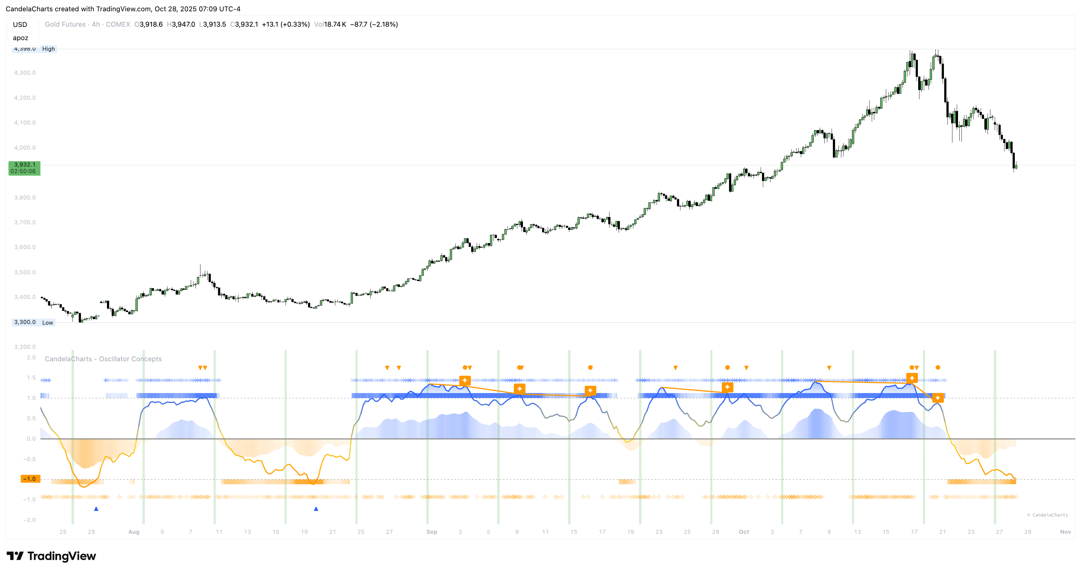
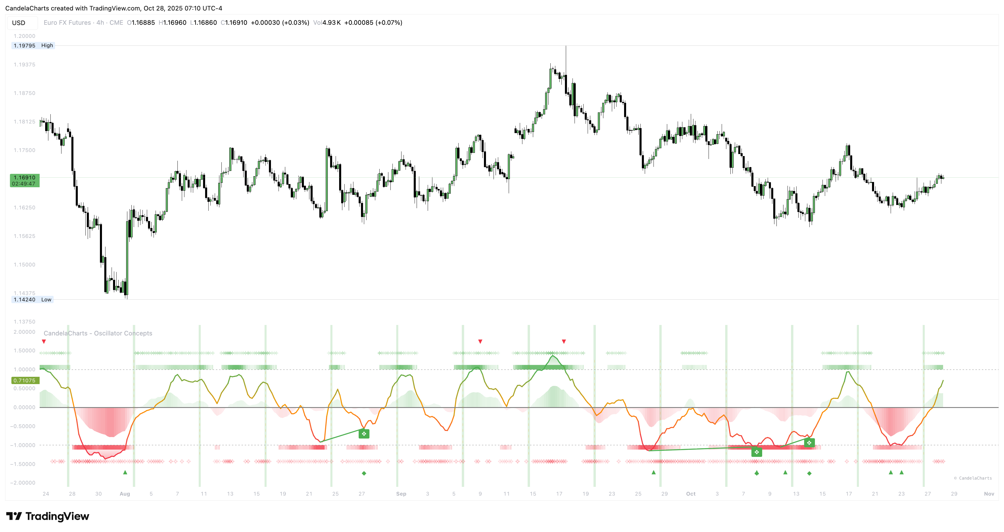
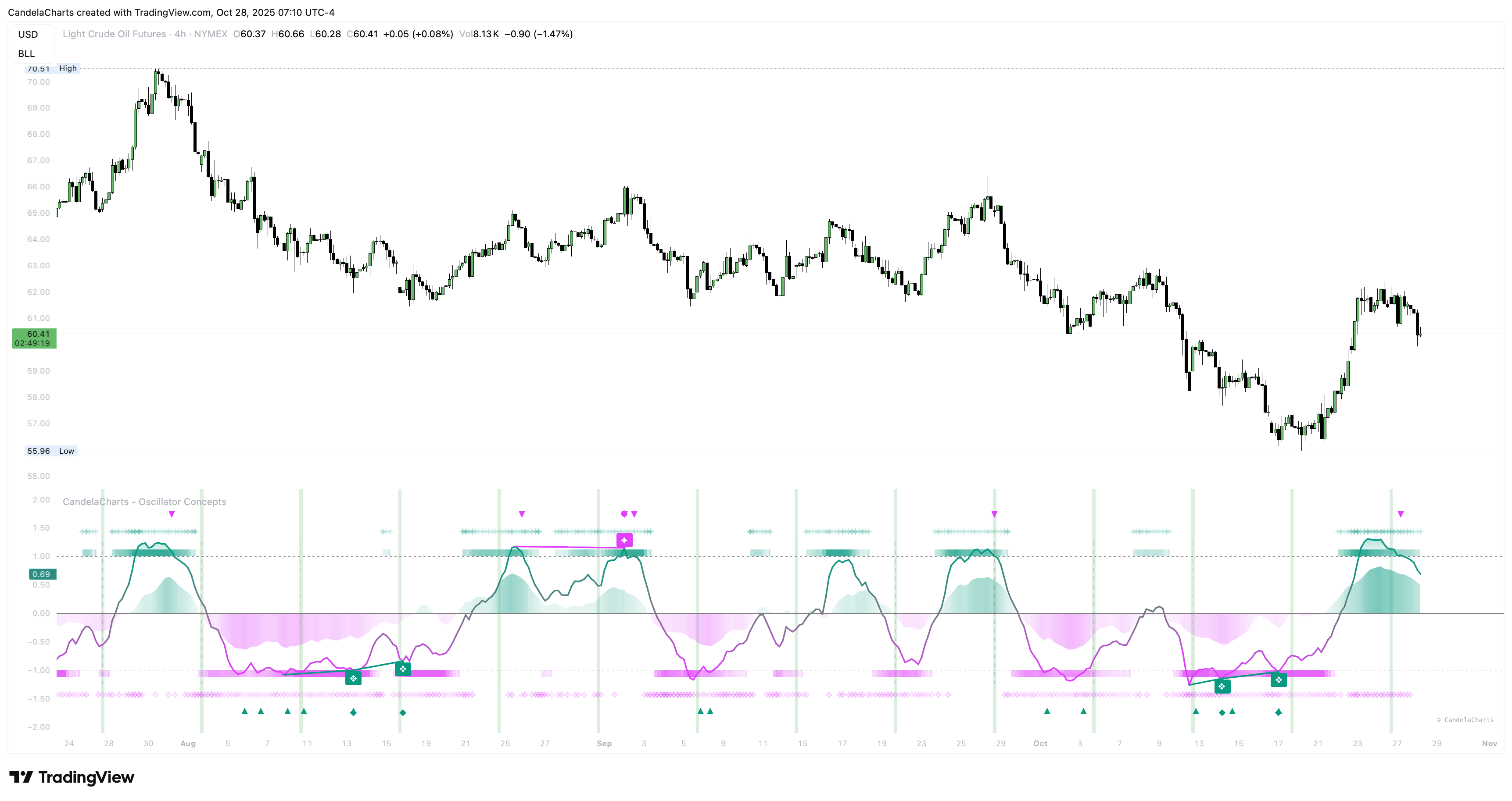
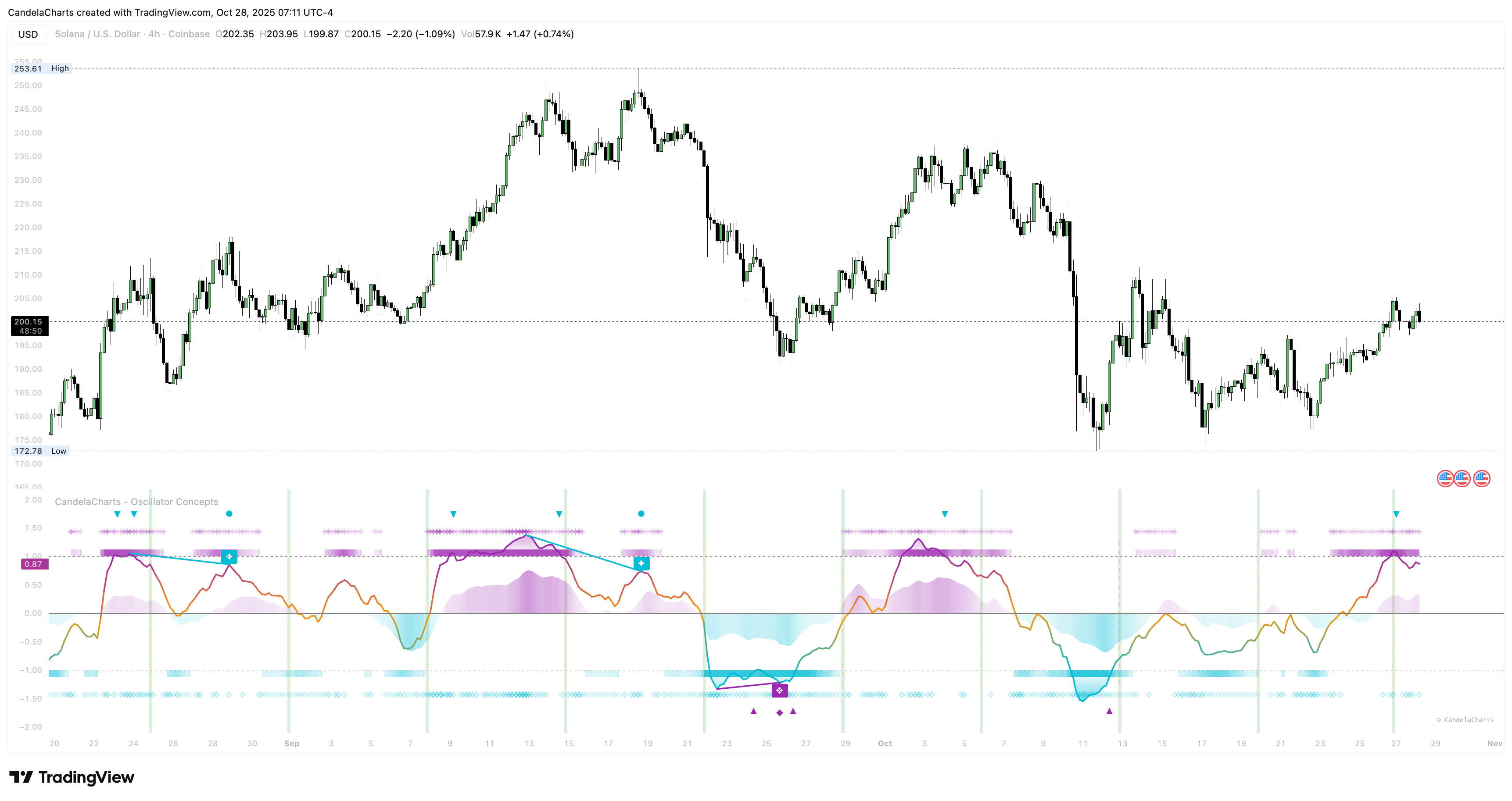
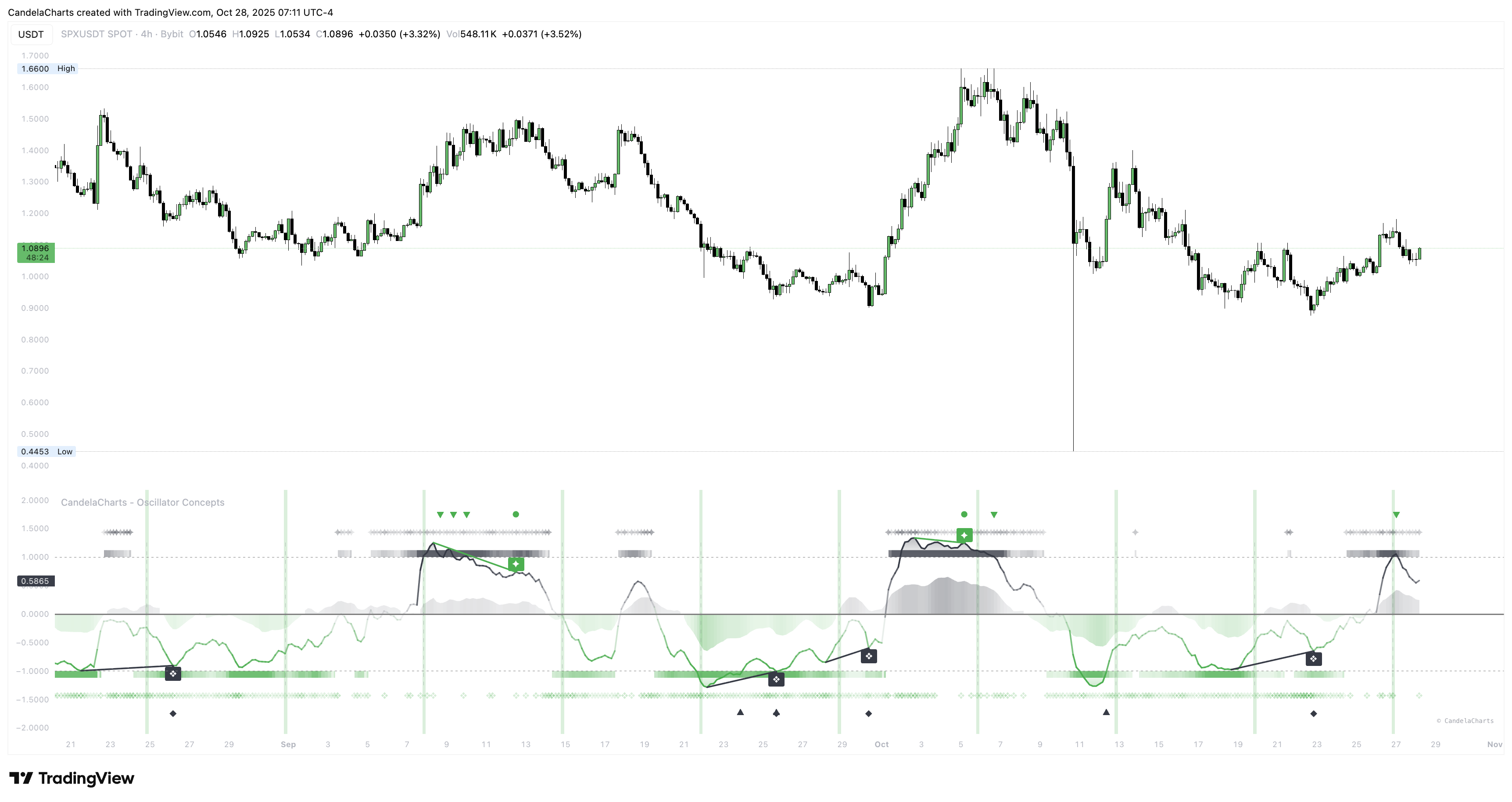
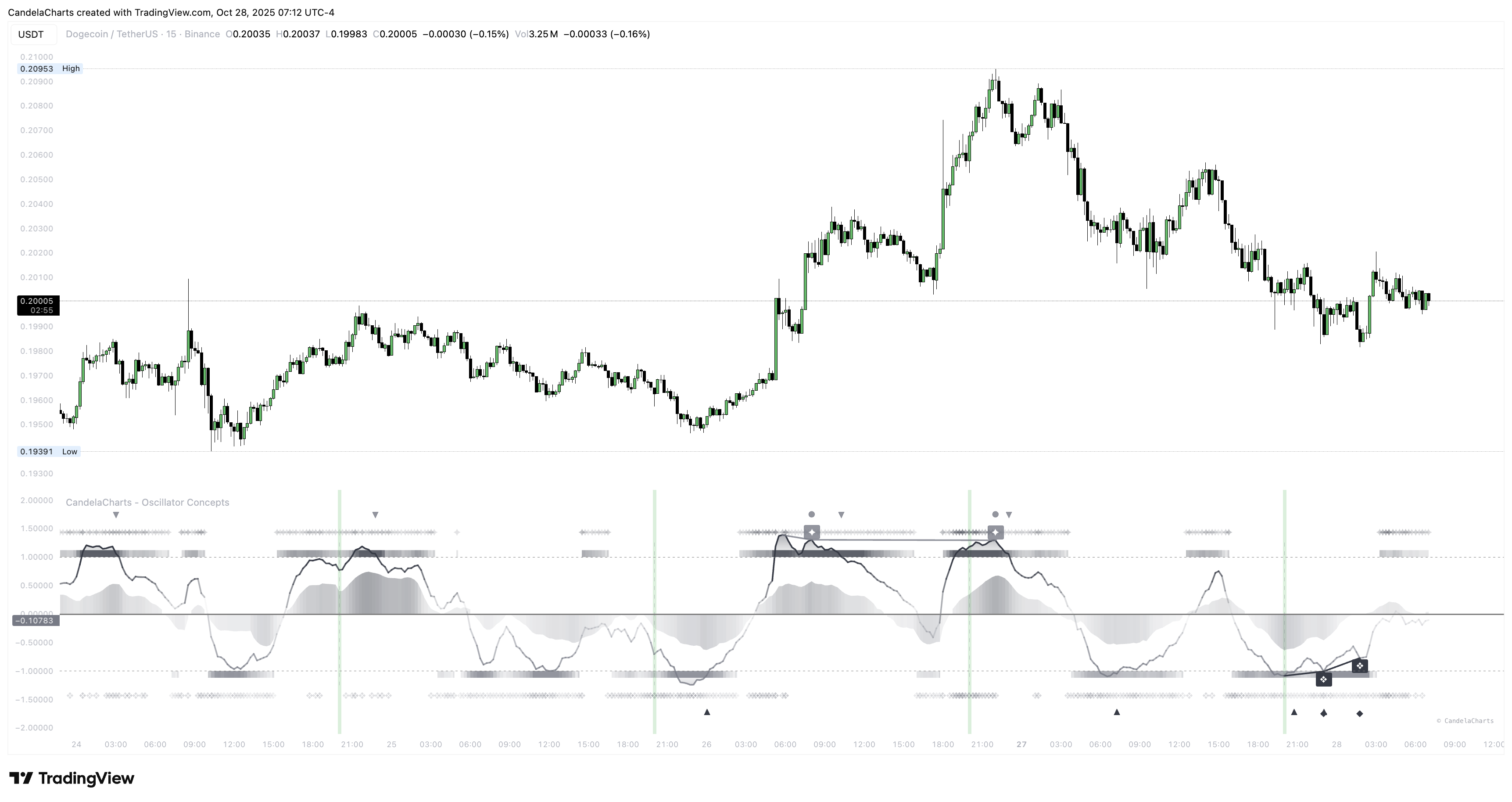
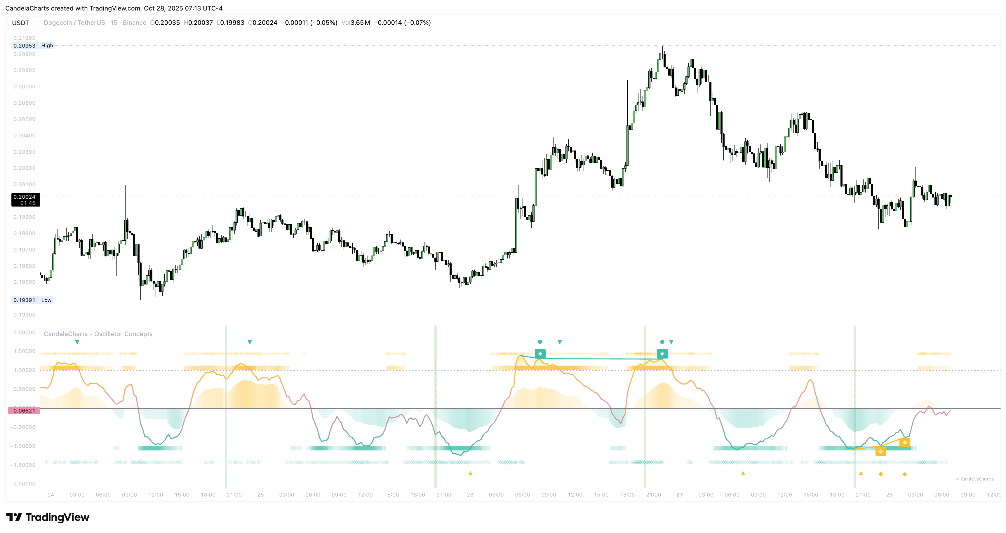
### **Built‑in palettes**
Carefully chosen color sets work on light and dark charts and keep meaning consistent across modules. They aim for clarity and legibility rather than flash.
#### Blue - Orange
#### Green - Red
#### Teal - Fuchsia
#### Aqua - Purple
#### Black - Green
#### Black - White
### **Custom look**
Bring your brand colors. Give the tool three base tones—bear, neutral, bull—and it carries them through gradients, stripes, fills, and labels. Your charts look like *your* charts.
### **Consistency**
Green always signals building/constructive pressure. Red always signals pressing/defensive pressure. Keeping those meanings stable reduces mental load.
---
# Agent Instructions
This documentation is published with GitBook. GitBook is the documentation platform designed so that both humans and AI agents can read, navigate, and reason over technical content effectively. Learn more at gitbook.com.
## Querying This Documentation
If you need additional information that is not directly available in this page, you can query the documentation dynamically by asking a question.
Perform an HTTP GET request on the current page URL with the `ask` query parameter, and the optional `goal` query parameter:
```
GET https://docs.candelacharts.com/oscillators/oscillator-concepts-tm/themes.md?ask=&goal=
```
`ask` is the immediate question: it should be specific, self-contained, and written in natural language.
`goal` is optional and describes the broader end goal you are ultimately trying to accomplish on behalf of the user. GitBook uses it to tailor the answer towards what is most useful for that goal.
The response will contain a direct answer to the question and relevant excerpts and sources from the documentation.
Use this mechanism when the answer is not explicitly present in the current page, you need clarification or additional context, or you want to retrieve related documentation sections.